Building an able website is tough and at the same time, pretty easy. Tough – when you do not know the right way to make it attractive enough to arrest users. Easy – when you are expert enough to design it strategically to make sure it attracts enough eyeballs to promote the goods and service it is supposed to.
This is the reason, businesses nowadays rely on the best web designing agencies to design and develop eye-catching websites for their business. We at Business Promotion Online are one of the most sought-after names in this niche. Indeed, we pride in the fact that we come up with some astounding websites for our clients that make a difference in their online presence. This is because our experts follow the following trends that make a lot of difference.
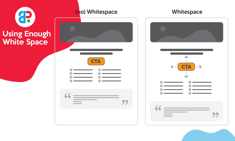
Using Enough White Space

This is the fundamental technique that every reputed web design agency in Perth would stick to and our experts are no exception. White spaces are essentially healthy for good web designs as they give a sense of comfort to the eyes. Moreover, it creates an illusion of openness and adds freshness to the website that makes a difference. Most importantly, it makes the content more comprehensible and helps the end-users to put the focus on supportive elements around the text.
But then again, there has to be a balance, particularly when it comes to stuffing too much info to deliver. Too much white space might cost you valuable information. Thus, there has to be a proper balance in the whiteness.
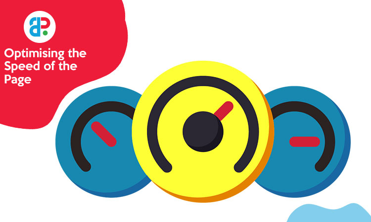
Optimising the Speed of the Page

The caption above is self-explanatory. People do not have all the time in the world these days to wait for a website to load up and open for them. With so many options available, it takes hardly any time for these blokes to shift to another site.
Therefore, the frustrating will the wait be for the website to load and open, the more will be attrition of visitors to other web pages. Hence, every quality custom web design company in Perth would leave no stones unturned to optimise the loading speed of the sites.
Using Enticing Call to Action

Customers these days are learned and smart enough to apprehend which content is pertinent to their needs and why. Hence, incorporating high attractive Call-to-Actions will enable the users to navigate through the site more easily and seamlessly. They will also help them to get precisely what they need or expect to find.
However, when it comes to creating these CTAs, these expert designers would keep in mind the concept of colour and the impact it will create upon the psychology of the users. That is where the experience and expertise of these web designers counts.
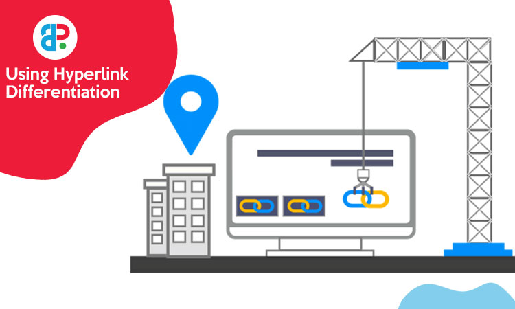
Using Hyperlink Differentiation

When a link is added to a page, it asks practically the user to click on it. That is why the designers of every custom web design company in Perth will make sure that the links are placed in locations that are effortlessly indefinable by the visual clues.
Presence of underlined text and texts that have different colours would draw the attention of the users quite easily.
Some other ways of making the websites visually appealing are by using hyperlink differentiation, segmenting information by bullet points, using images, incorporating well-designed and well-written headings, and maintaining consistency of the pages.
Therefore, you see, the acceptability of any website undoubtedly depends upon the expertise of the web designers. That is the reason you need to depend upon a quality web designing company with years of experience. What better name can you get than Business Promotion Online?
For further details, call us at 0433 985 962 between business hours and emailing us at info@businesspromotingonline.com.au.

